Herizon
A cohesive brand identity and geometric design system built for an annual flagship summit dedicated for empowering women in STEM.
00

problem
In historically male-dominated engineering and STEM environments, women often face subtle barriers to visibility. When empowerment summits do try to address this, their branding often falls into superficial, clichéd aesthetics that lack structural depth. For an event organized within an elite engineering community like Pulchowk, the visual identity needed to move far away from generic design tropes. It required a system that felt institutionally rigorous, mathematically precise, and deeply representative of women breaking boundaries in tech and society.
solution
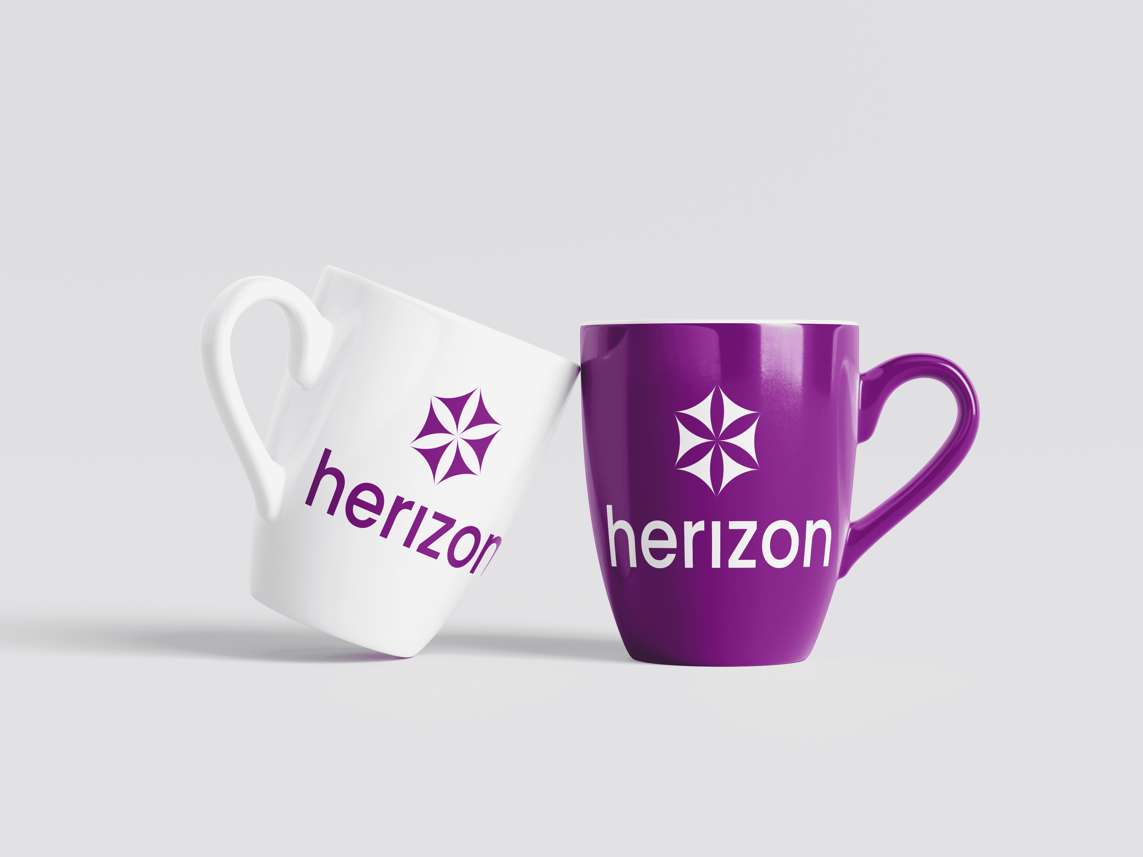
Herizon bridges this gap by blending women-centric storytelling with mathematically precise layout structures. By anchoring the entire visual identity within the mathematical framework of the Seed of Life and the structural efficiency of the honeycomb hexagon, the branding speaks the literal language of design and engineering. The branding and design system scales across social-media marketing, digita posters and flyers as well as physical event merchandising.
The linguistic identity of the project beautifully synthesizes "Her" and "Horizon", symbolizing the limitless possibilities that open up for women when they are provided with opportunities, mentorship and visibility. To honor this vision, I developed a sophisticated visual identity rooted deeply in natural harmony and mathematical symmetry:
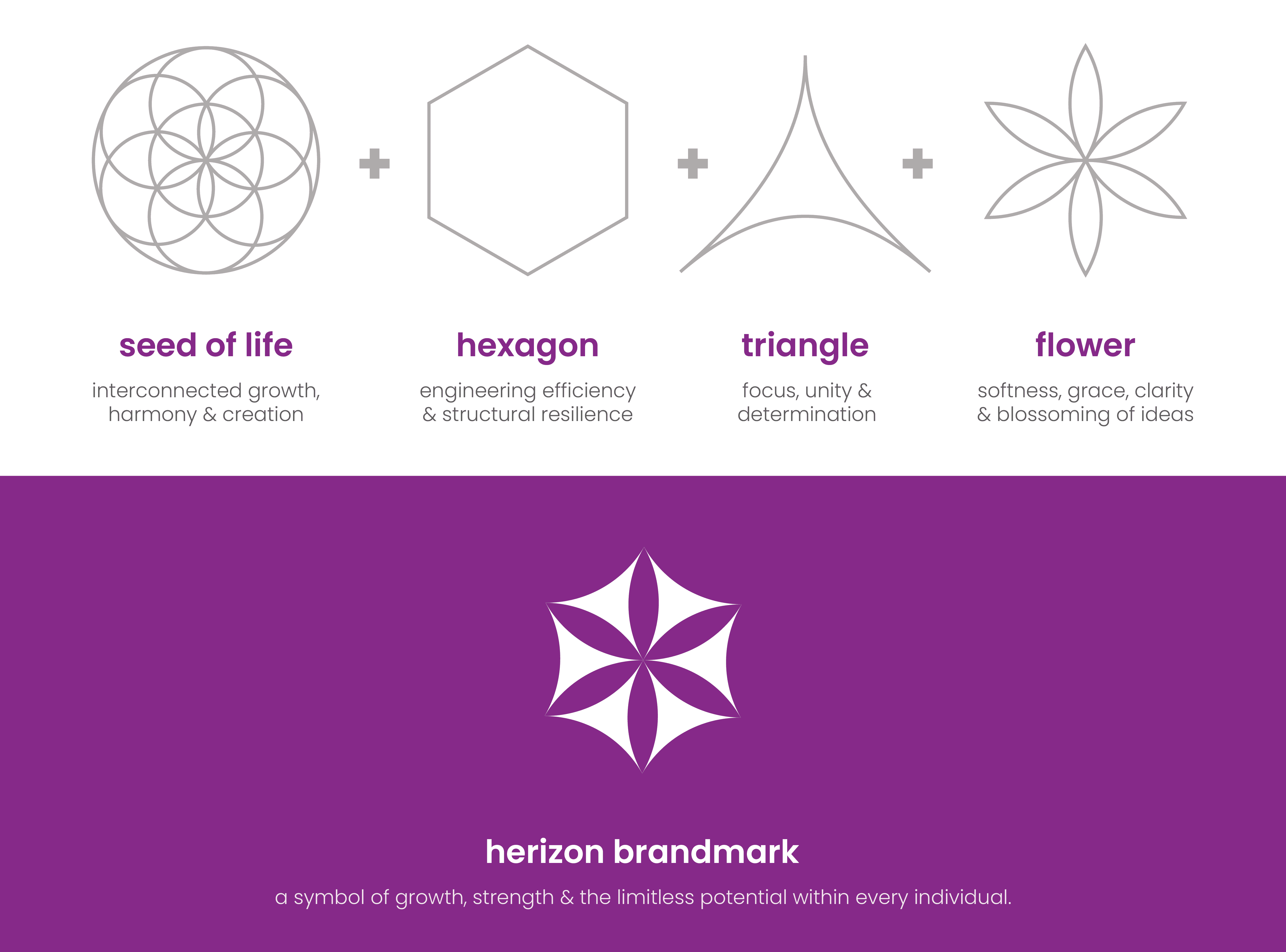
The Sacred Geometric Foundation: The logo is built entirely upon the structural guidelines of the Seed of Life, a universal icon of creation, harmony, and interconnected evolution.
The Central Flower: At the exact nucleus of the brandmark sits a six-petal flower forged through negative space. It gracefully represents softness, realized potential, clarity of vision, and the beautiful blossoming of ideas when knowledge and opportunity finally intersect.
The Converging Triangles: Surrounding the central flower are six inward-pointing concave triangles. These shapes symbolize collective unity, determination, and the deliberate convergence of diverse female perspectives moving together toward a shared societal purpose.
The Engineering Hexagon: The outermost perimeter forms a clean hexagonal foundation. Inspired directly by the natural architecture of the honeycomb, it stands as the symbol for engineering efficiency, structural resilience, and the collective strength found within a supportive, unified community.
Checkout the Brand Book at: Herizon
year
2025
timeframe
16 days
tools
Adobe Illustrator
category
Branding and Identity
01

02
03

04

see also